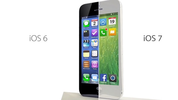
Apple’s iOS 7 can’t help but leave you with mixed doubts. On the one hand, it’s such a great update. The newly brought design changes implemented on this iteration are much welcome. They make even iOS 6 look dull, mainly due to the new, bright range of color palettes. Also, the Control center brings quick toggles and changes to the OS which weren’t present before.
But somehow, you do feel the something-is-missing feeling. The features which are much-admired (Control center to name one) are already present in other competing operating systems for ages now and Apple will have to play catch-up again in iOS 8.
Let’s start with the much touted design changes. The design changes feel nice to the eye, mainly because most of us were just so bored with the previous OS versions. The bright color palettes are pleasing to the eye and should appeal to a large number of people although serious businessmen might feel bitter.
Also the new icons (especially the App Store and iTunes Store icons) look copied from Nokia Belle OS. Not only this, the Control Center is strangely similar to something we’ve found in Android almost as long as we can remember. Also in other places, several design cues seem to be borrowed from Windows Phone and again Android. The new icons may be pleasing to the eye but not each and every one is good-looking. Also some are too complicated, while others are plain dull.
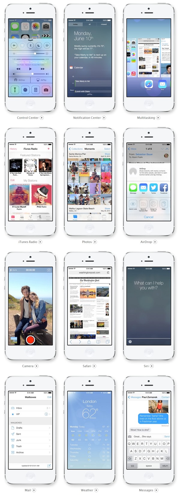
Almost all the features brought to iOS 7 were either missing features, or improvements brought to already existing ones. Just take a look, for example, to the iOS 7homepage on Apple’s website. Almost none of it is new. Control center, Notification center, Siri, Safari, Camera filters & UI changes, better multitasking, updated photo gallery, iTunes Radio and Air Drop are all but old features. This will be gravely disappointing especially for iPhone fans who have to wait one whole year just to get new features. Also it is disappointing because Android is quickly sprinting away and Windows Phone closing up on iOS.
That said though, iOS 7 was not bad at all. It is a welcome change. Siri finally seems really good to me and so is Safari. Camera UI seems to be getting more user-friendly and the swipes which sort-of try to make up for the lack of a back button in certain areas like Safari are all really welcome changes. And I’ll be an ignorant if I dismissed the Air Drop as just another way of communicating. But are these earth-shattering and new to the core? No.
In short, these aren’t perks but necessities which had plagued more than a few Apple users and were things were changed because they needed to be changed. The iOS 7 update, then, should be fine for hardcore Apple followers but won’t be doing much to lure people from other platforms. Let’s hope things get better with iOS 8.
Check below some screens of the iOS 7:

No comments:
Post a Comment